New year, new logo, same me.
As you can probably tell by now, things are looking a little different around here. Starting a new year and the realisation that I have made it to the 5-year-working-for-myself-full-time milestone I wanted to reflect on my business. This is probably something I haven’t done enough as I pack my days with working on client work. I am always focused on that next thing so to spend the last two weeks, looking at how far I have come, how I have evolved, how my business has evolved has been so important to me. I wanted to take you through the changes because a) you have been a part of this journey & b) it’s the fun stuff.
Where it began
I quit my part-time job & started working for myself full time at the end of January 2014. At the time all I was doing was hand lettering custom prints and a print collection here & there.
I must have got over that original logo pretty fast and changed it up to some hand-lettering that I cleaned up into a vector logo. It still had the flow of the original but was definitely more legible. I have kept this logo until now.
why did I change my logo?
Long answer short, it no longer felt like ‘me’ or my business. It goes without saying but since 2015 I have grown and evolved personally as well as my business. I wanted to update my branding so that it could grow with me. Everything will be the same, it might just look a touch different. As much as I would love to go back to 2013 and not use my name as everything, my name is my brand as that is something I knew I had to keep when I started designing. My business is now more than just me as a person or my hand lettering. I spend my week doing everything and anything from Hand Lettering, Graphic Design & Branding, Photographing & Styling, brainstorming Creative Direction and Personal Content like Partnerships, Public Speaking & Blog Posts. But it is mostly still just me.
Studio Jasmine.
What did I set out to do with my new logo?
First priority was for it to represent all of the different areas of my business more than my current logo. Secondly I really wanted it to be timeless and a solid base to be able to build and add to. In its purest b&w form it needed to feel like me, and be able to be embellished along the way for different uses.
COLOUR
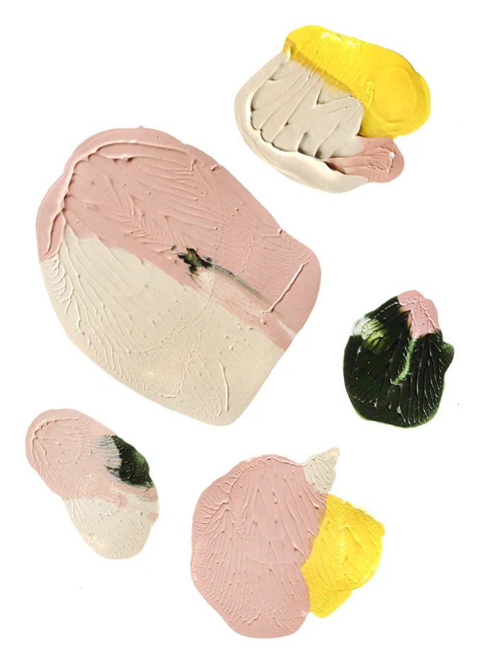
My logo will always be displayed in black or white however it wouldn’t be me if I didn’t have some fun when it came to colour. It wouldn’t be me without some pink in the mix but also adding in some yellow, dark green & throwing in some blue & deep red along the way as well. A broad colour palette gives me room to play with all of the branding elements that I produce.
Shapes & Additional Elements
It was important that my branding included elements that enhanced the base logo. You’ll be seeing the waved circle around the place and I am excited to see where playing with that takes me.
I hope you guys love the new look and keep clicking on my new display picture
when it pops up on your socials. Thank you for being around for any part of the last 5 years, I
truly freaking love what I do.
jasmine x


